Web design can often be complicated however there are several rules and guidelines that should be followed if you want to avoid some of the most common web design mistakes.
In the past, many web designers focused their efforts on designing a site that was an eye catcher. This meant they would design a site with a lot of colors, animations, and other features that could easily catch the eye of any visitor. However, as the time has passed, the focus has changed dramatically. Pretty sites are still appropriate but the shift has changed to sites that meet certain specifications such as search engine optimization requirements and relevant content. Therefore, for those who want to ensure they are avoiding some of the most common mistakes, here are some tips that can help with these objectives.
One of the first mistakes is designing a site that is too crowded and too busy. To ensure a nice design, the designer should make sure there is a certain amount of "negative space" or "white space" on each web page. This is one of the design elements that can easily affect how the visitor views what is important on the site. Therefore, by using white space between columns, lines and paragraphs, one can identify the things that are considered to be most important.
Another common mistake is not being able to identify the information that has changed on the page. People who visit the website on a regular basis do not like sifting through older information in order to get to the most updated content. This can be an easy turn off to many visitors. To solve this issue, one way to approach this problem is to list the content in descending order based on the post date instead of using an ascending order. Another way to solve the problem is to devote a specific section on the page to new content.
In addition to crowded pages and failure to identify the most recent content, hard to find links are also a common mistake made by many website developers. Hard to find links and links that cannot be identified are also very frustrating to visitors who access certain web pages. To avoid these mistakes, the designer should make the links stand out by using specific colors, underlines or different kinds of text. Blinking text is not recommended, however, because it can be very distractive to the reader.
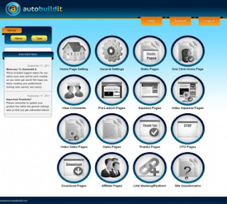
Learn more about Auto Build It Software here. Auto Build It Software, we feel is the best website development software by far for both newbies and professional website creators. source.


No comments:
Post a Comment