Whether it's blogs, articles, white papers or guides, you're content has to be engaging, informative and interesting to users. That said, you may well have engaging content, but if the design itself doesn't attract or invite users in, then your hard work creating that content may have been to no avail.
Design plays a huge role in the success of your content, from the layout of your homepage through to the colours used on your blog posts. First impressions count even more so on the web than they do in offline media. Using an interesting image or photo at the top of any article, guide or blog invites users in and provides an insight into the content of the article. Attractive fonts have also proven to encourage users to read and help make titles and headings stand out.
Headings and sub-headings are extremely important for online content. Large blocks of text can often seem daunting and deter many users. Dividing chunks of text with headings and sub-headings not only makes the content appear much more manageable but also gives users who glance over the article an insight into its topic.
Good content is often defined by three main adjectives: interesting, engaging and shareable. It's essential that you give users the opportunity to share your content over a variety of platforms. Ensuring you provide users with sharing buttons for the top social networks encourages users to share the content they enjoy.
When it comes to images, while Flash may look great from a design perspective, this should be avoided from an SEO point of view. Search engines cannot index Flash as it tends to be very image heavy, making it difficult for search engines to read the embedded text.
When designing layouts for articles or guides, remember to leave enough space for all your content. Don't pack lots and lots of content into one page, it only creates a poor and unenjoyable user experience. Line spacing has a huge impact on the readability of text and the lines length should be restricted as wider paragraphs are harder to read.
Using the bold, italics and underlining features to highlight important sections or keyphrases, may sound like a simple seo web design technique but is used as an additional indicator of relevancy to the search engines. You can also go one stage further by using call outs and highlighting these in different colours or font sizes. Text boxes with different coloured backgrounds or borders also have the same effect.
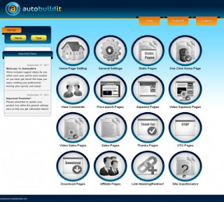
Learn more about Auto Build It Software here. Auto Build It Software, we feel is the best website development software by far for both newbies and professional website creators. source.



No comments:
Post a Comment