The principle of effective web design is not just to make a webpage prettier, but to make it easier to communicate. However, designers skip this key factor and stuff their website with flashy texts, distracting background, useless graphics, etc. These efforts do nothing rather distract the visitors from the main target, resulting into low traffic and instability of the visitors on the page. To stick the visitors to the page, there are few elements that have to be considered to develop an effective web design.
Readable Text
Text is the central attraction of any website, as it provides information about the product and the services. Hence, it must be readable. Try to set its font size and type which are easier to read. Beside, make sure that the background you choose is not interrupting the text on the page.
Clear Navigation
Most of the time, visitors prefer to move out of the page just because the navigation structure of the site is not clear. To avoid this, make navigation button and bars easier to understand. Button and bars give clear understanding of their current location on the site. Keep it consistent throughout the website. If you are developing larger website, creating an index or site map is advisable.
Detectable Links
Links may not seem very important to concentrate, but practically they are of subject to focus. Links on a page takes users to the targeted pages. Uncoordinated color of link and the page might not draw users' attention. To make it clear and understandable, underline it. Beside, avoid underlining non-link text, as it may create confusion.
Wisely used Graphics
Use graphics only where it is needed. Unnecessary graphics increase loading time and make it difficult for users to wait too long. If is necessary, use browser safe colors for graphic and background. Besides, if you have to use graphic animations, keep an option that enables them to turn off by themselves. Else, unknowingly you might be irritating your visitors. The best way to use graphic elements like photos, subheads, pull quotes, etc. is to break large text area. This keeps the users' intrigue in reading the texts.
Overall web design
Keep the website design as simple as possible. A simpler web design will minimize the loading time. To make web design visible in all platforms, your first page or home page must fit into 800 X 600 pixel space. All of the other pages will automatically have visual impact of the same pixel range. Keeping the consistency of web design is another important factor, which cannot be ignored. For this, create each web page similar to the other. So that they look like they belong to same web site.
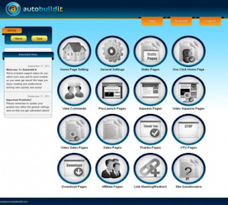
Learn more about AutoBuildIt Software here. AutoBuildIt Software, we feel is the best website development software by far for both newbies and professional website creators. source.






No comments:
Post a Comment